 2,345 words
The pictures on my wall
Are about to swing and fall.
— Echo & the Bunnymen
I think images are worth repeating.
Images repeated from a painting.
— Lou Reed & John Cale, Songs for Drella
There are many irritations in life, and one of mine is that I am not an artist. Can’t paint, can’t draw, can’t sketch. Even my stick men look unconvincing. Nor do I know a great deal about the subject. But the old saw — “I don’t know much about art, but I know what I like” — although variously attributed, works for me, and I had a salutary lesson on the power of the visual image in 2001, in the main Vancouver Art Gallery.
I had been in a downstairs room looking at Rembrandt’s preparatory line drawings for his deposition and crucifixion paintings, and marveling at the deceptive ease of it all. It looks so simple, just lines on white paper, and yet it is impossible for all but the rare few. I suppose writing War and Peace or Ulysses looks easy, as it’s just words on a page. Such is art.
Plastic art is, of course, visual, and the initial impression is either soon forgotten or stays with the viewer. We all have a mind’s eye — one of the many fascinating aspects of being human — and you can conjure up your favorite images at will. This is unlike dreaming, where the images seem to have control and to have their own will. Close your eyes now and think of the faces of your family. Like images on a magic lantern, they will appear. Where and how these pictures manifest themselves is a mystery which Freud attempted at length to unravel, as did Descartes with his strange theory of the pineal gland. The most memorable summation is by Saint Augustine, when considering where pictorial memories go when we are not, as it were, using them: “To a place which is as yet no place.”
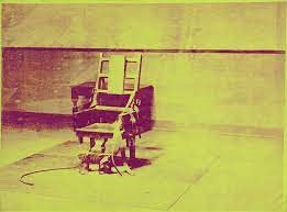
In Vancouver, and post-Rembrandt, I was about to see an impactful image that has stayed with me ever since, place or no place. I walked up the stairs to the next gallery and saw something which explained to me the power of visual art. It was one of Andy Warhol’s Death and Destruction series, entitled Electric Chair Yellow. There are many different silkscreen prints, but I know that this is the one because the color is likewise stored away in the mind’s eye — or at least its archives — along with the image. It hit me like a sock on the jaw.
I am not interested here in the merits of technique, or modern art versus classical art, or any other non-phenomenological aesthetic concern outside of the raw image and how it is processed by the observer. When you see any visual image for the first time, you don’t have a choice as to whether or not you like it. It’s not like a pop song, a poem, a symphony, or a novel, which take longer for an aesthetic decision to be reached because they are temporal in the way plastic art is not. With an image, you either like it or you don’t — although you may be indifferent — at first sight. You don’t get to choose, as art has a strange habit of trumping reason. You may not know much about art, but somehow you know what you like.
You can buy Kerry Bolton’s More Artists of the Right here.
Any amount of thinking about art is already overthinking (unless you are an artist or a historian of the subject). With visual, plastic art, the experience of the image is different from other artistic experiences because it arrives all at once, whole and entire, and does not rely on temporality, like novels or music. Yes, you can read “narrative” into a picture, in one sense. One of my favorite paintings hangs — or at least it did last time I checked — in London’s National Gallery: Joseph Wright of Derby’s Experiments with an Air Pump, and the picture tells a visually complex story concerning differing attitudes towards science in eighteenth-century England. The faces as you look around the table show varied responses to the experiment taking place (which involves putting a bird into a vacuum) from adults and children alike. I was very lucky when visiting the National Gallery, because another great favorite of mine hung almost exactly opposite Wright’s painting: J. M. Turner’s 1838 painting known (by its short title) as The Fighting Temeraire. It also tells a story, albeit a simpler one. So, although there may be narrative waiting to be unpacked in a painting, there is far less with the immediacy of the image.
We understand what it is to see a painting or image, but perhaps not the unmediated impression its immediacy leaves with us. An image comes at you in its entirety, before you parse it in terms of meaning, as with the aforementioned Joseph Wright. Culturally, the album cover is a prime example of this instantaneous effect.
Album cover art had its glory days with vinyl LPs. Cassette tapes and CDs just didn’t have the space to support good art, which is what the best album covers are. Cassette boxes also had a different aspect ratio, and further reduced the available size for the image, as almost all vinyl album covers are square. There are so many famous covers, and I bet you can visualize plenty of them.
Going through the visual Rolodex of memory, I find that many of my favorite covers seem to come from England during the last two or three years of the 1970s, a brief era broadly known as “post-punk,” and ten of them are below. I’ve also included a favorite song from each album which might serve as an introduction if you don’t know the band but like the cover. All but one of the albums are debuts, and I note that none features pictures of the band — at least not on the front cover. So, in reverse order, pictures at an exhibition.
The Sisters of Mercy
First and Last and Always

A band named for a Leonard Cohen song and whose singer took his pseudonymous surname from an H. P. Lovecraft story were always going to attract me. I never saw them, sadly, but loved their grand guignol sound, a drum machine rather than the real thing, dark and chiming guitars — the horror-movie baritone voice.
Singer Andrew Eldritch was treated rather unkindly by the British music press when the band were at their zenith in the 1980s. A diminutive man always seen in shades (like Lou Reed), the press called him “Dwarf Vader” and dismissed the band as Goth theatrics. I knew someone who had seen them and he described them as “camp disco,” which sounds like a fun summer retreat.
Red and black happen to be a favorite contrast of mine, which may explain the appeal to me, but the image — which I suppose is more graphic design than art — is pleasingly dark, like a chocolate box possibly containing poisoned chocolates.
Key song: “First and Last and Always”
The Pop Group
Y
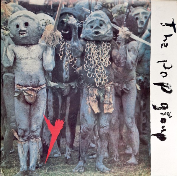
The cover stars of The Pop Group’s acclaimed debut are the Mud People of Papua New Guinea, which is a pretty good band name in its own right. I think I did see them, and they were one of the bands who led to the domination of certain adjectives used to describe post-punk music: angular, jagged, abrasive. It all sounds quite dangerous, but then the Mud People of Papua New Guinea are not a bunch you would want to run into on a dark night. The childishly-daubed script goes with the main image’s primitivism, and the whole has a disturbing aura. Post-punk helped to break the link between pop and rock music and its traditional visual lexicon, and the best covers were incongruous, at an obscure angle to standard rock ‘n’ roll imagery.
Key song: As a bit of a Nietzschean, I have to go for “She is Beyond Good and Evil,” although to be accurate the song is not on the original album, but was added to a reissue.
The Scars
Author! Author!
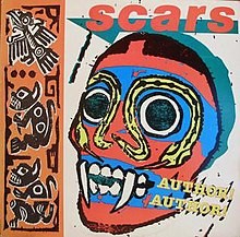
This has to have sold well in Mexico, and the Latin American color tones make it stand out from the rest of my rather somber choices. A Scottish band I know very little about, this was another album cover that commanded the eye on first acquaintance. A good example of the out-of-kilter image.
Key song: “Leave Me in the Autumn”
Magazine
Real Life
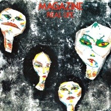
Howard Devoto quit seminal Manchester punk band Buzzcocks in 1977 and formed the more cerebral Magazine. It was thanks to Devoto’s choice of cover art that I discovered French Symbolist painter Odilon Redon, whose work borders on nightmare without going full Fuseli. That said, the cover for Real Life was by Linder, artist and singer of the band Ludus.
Key song: “Motorcade” With its lyric about the Kennedy assassination, I would be amazed if this song has never been used in a movie, as it is perfectly filmic.
Joy Division
Unknown Pleasures

The word “iconic” is getting a bit stale through overuse, but the cover of Joy Division’s debut qualifies as such, and is certainly revered by fans as much as any sad-looking Russian saint’s image ever was. It was always a T-shirt waiting to happen, and so it proved. And it didn’t stop at T-shirts, should you require an Unknown Pleasures A-line dress. An explanation of the image made me chuckle: “In simple terms, the image is a ‘stacked plot’ of the radio emissions given out by a pulsar, a ‘rotating neutron star.’”
You have to love that “in simple terms.” Neutron stars and stacked plots are not my area of expertise, but this cover is lurking in many a mind’s eye, and the band’s label, Factory Records, were famed for their stylistic innovation. My piece on the band is here at Counter-Currents.
Key song: “Shadowplay”
Adam and the Antz
Dirk Wears White Sox
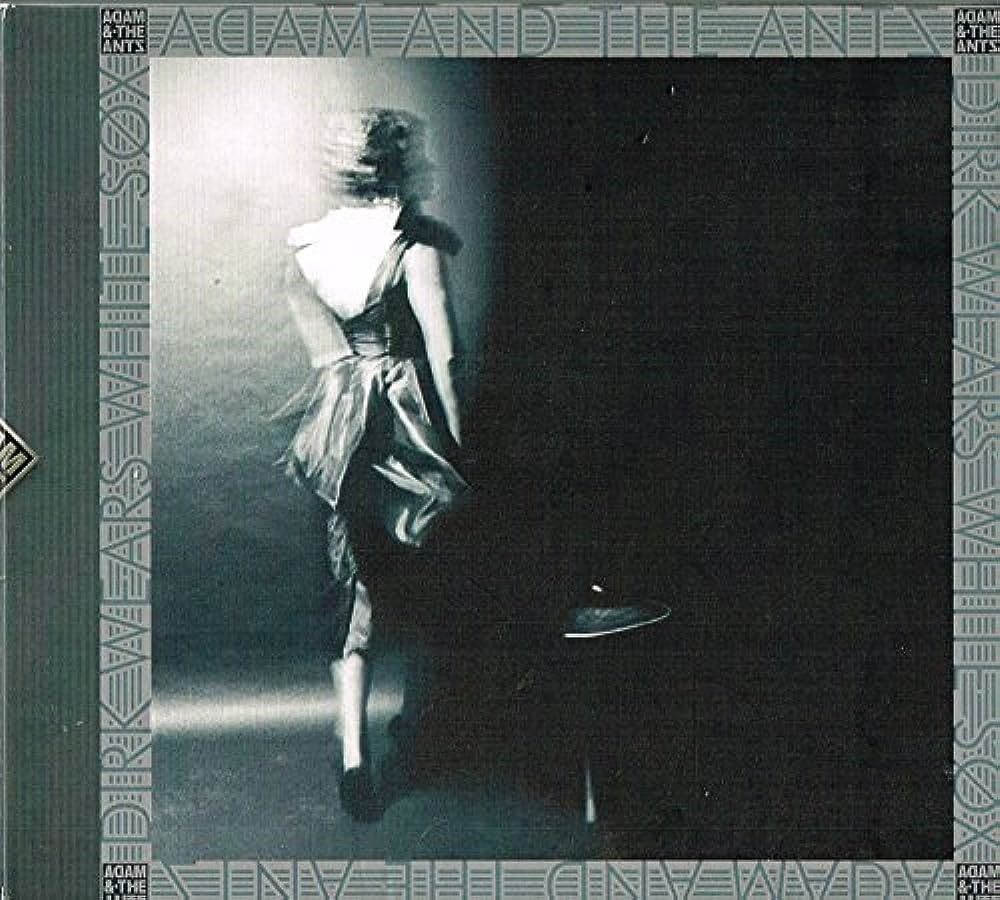
If you only know Adam and the Antz from the band’s later, neo-glam career highlights “Prince Charming,” “Stand and Deliver”, and “Kings of the Wild Frontier,” think again. They were, briefly, the biggest pop act in the United Kingdom, and Adam Ant was all over the media. But before fame arrived their debut album, Dirk Wears White Sox, was a strange treasure. There is a lot of humor in Adam Ant’s lyrics, not least in the song noted. It is a haunted cover that looks as though it should be on a collection of Victorian ghost stories.
Key song: “Car Trouble”
The Fall
Dragnet
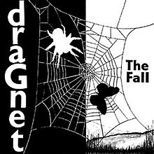
I have written about the late Mark E. Smith’s band The Fall here at Counter-Currents, and this is the only cover on my list which isn’t from a debut album, Dragnet being their second outing. This image is so stark and compelling I remember exactly where I bought the album: at the Rough Trade record store in Ladbroke Grove, the week it came out. The mind’s eye seems to function better when the central image captured by the original experience is vivid, fresh, and visually unequivocal.
Key song: “A Figure Walks”
Siouxsie and the Banshees
The Scream
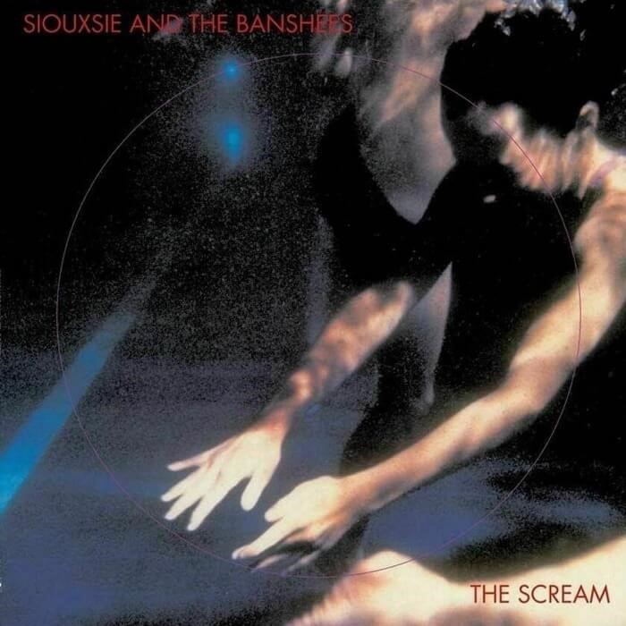
Siouxsie Sue grew up close to where I did, in the margins of London, and her early music was steeped in suburbia, one song on this debut even being called “Suburban Relapse.” “I’m sorry that I hit you,” she sings in her early vocal style, that of a neurotic Valkyrie, “but my string snapped.” I had a brief and enjoyable conversation with Siouxsie at Croydon’s Greyhound Club in 1979, at the bar. I stepped back and stood on someone’s foot by mistake, for which I apologized. It was Billy Idol, from Generation X. He really was wearing blue suede shoes.
An album called The Scream might be expected to have Munch’s famous painting on its cover (although I imagine copyright fees for a debut album by a relatively unknown band would be crippling), but this cover out-thinks everyone. It’s as much color field as photograph, and matches the music perfectly.
Key song: “Overground”
Bauhaus
In the Flat Field
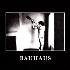
I have been rather unkind about Bauhaus in the past, and this reminds me of the comment John Lydon made about the first Manic Street Preachers album, Generation Terrorists. Great album cover, said Johnny Rotten, just as long as you remember to take the records out and slip them behind a radiator. Bauhaus just tried a bit too hard to be strange, and the best bands did so effortlessly. But I found and still find the album cover so striking it was only just kept off the top spot. Key song (I suppose there has to be one): “Dark Entries”
Wire
Pink Flag
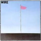 This takes us back to where we started, with Warhol’s print in Vancouver. This image just picked me up by the scruff of the neck. As soon as I saw this cover, I more or less decided I was going to like the music whatever it was like. Fortunately, it is a classic I still listen to today, as do a lot of other people who admire this influential band. REM were impressed enough to cover “Strange” on their album Document.
Wire were — and I believe still are — a classic English art-school band, and the starkness of the image, plus the apparently meaningless title, was probably not the result of dashing something off, but waiting for an image to emerge that captured the eye and held it fast.
Key song: “Reuters.” With a lyric concerning a reporter in a doomed country, with resources running low, this ends strangely, with the word “rape” being used as a mantra over the outro.
If you are either already an aficionado or interested by British post-punk, my review of Simon Reynolds’ book Rip It Up and Start Again, which covers the period, can be found here at Counter-Currents. But in terms of my mind’s eye, this was a rich visual period for me in which the art was inseparable from the music — and these are some of the pictures on my wall.
* * *
Like all journals of dissident ideas, Counter-Currents depends on the support of readers like you. Help us compete with the censors of the Left and the violent accelerationists of the Right with a donation today. (The easiest way to help is with an e-check donation. All you need is your checkbook.)
For other ways to donate, click here.
5 comments
Echo & the Bunnymen’s “Heaven Up Here” always struck me as an iconic album cover (and album).
Seems cover art is a lost art …
A really enjoyable walk down memory lane.
What? Nothing from 4AD (23 Envelope) ?
Good point. They had fantastic aesthetics. Only they could induce me to buy albums just because of the covers.
Mark I enjoy your sojourns through the post-punk realm… arguably tied with the 60’s as the most interesting progressions in popular music. While I was never a huge fan of the Pop Group, their clan always picked eye catching covers. The solo album by Mark Stewart is burned to memory – As the Veneer of Democracy Starts to Fade probably had anti-right fears in the mid 80s, but we all now who the current censors are.
While The Smiths are much loved (and reviled), the early artwork of brooding ageless portraits influenced the whole C86 crowd right through to practically every Belle & Sebastian record. Meat is Murder became a cliche but nonetheless effective advertising campaign. This Charming Man featured on the more immortal shots from Cocteau’s Orpheus.
Public Image Limited’s Metal Box was one of the rare examples where over the top packaging (three 45 rpm 12 inch records packaged in metal canisters) was supported by a visionary album, albeit still forbidding to many.
And there is never enough to be said of The Fall, whose N.W.R.A. might be a theme song of some of the obsessions circulating here. I’d add the front/back cover of Hex Enduction Hour was part of a trend intentionally thumbing its nose at typesetting like the lively and disorienting din within. Many DIY acts followed the trend to visually set themselves apart from what a corporate label might issue, right through to the early Pavement artwork. The north will rise again!
Comments are closed.
If you have a Subscriber access,
simply login first to see your comment auto-approved.
Note on comments privacy & moderation
Your email is never published nor shared.
Comments are moderated. If you don't see your comment, please be patient. If approved, it will appear here soon. Do not post your comment a second time.